
 Personal Style
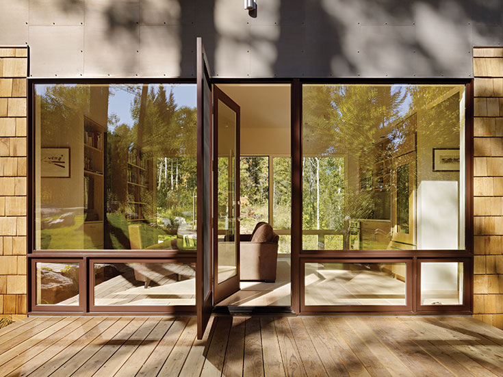
Story By
Kirsten Rue
Photos By
Tuck Fauntleroy
Matthew Millman
Roger Wade
When you live in Jackson Hole, friends and family will want to visit you. That’s simply a fact. And, indeed, for many homeowners, expanding families are exactly what lead to the need for a place to house them—comfortably, in privacy—on one’s own property. Enter: the guesthouse. Constrained by zoning requirements that usually limit a secondary building on one lot to 1,000 square feet or less, Jackson Hole architects must find ways to work innovatively within the restraints of size and site to create harmonious buildings that meld with the main house and the lifestyles of family.
Here are three altogether different—altogether successful—approaches.
1 | THE JUMPING-OFF POINT
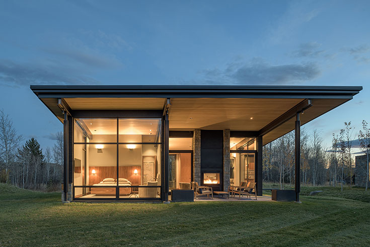
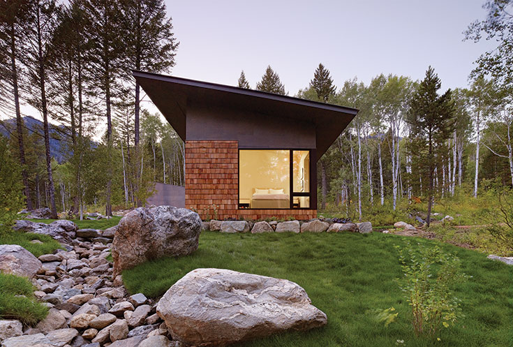
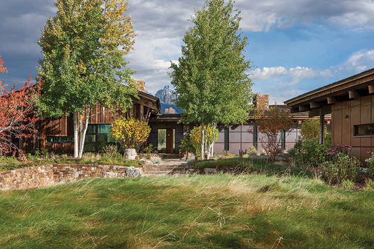
Carney Logan Burke principal John Carney’s guest home began with a wooded lot on Fish Creek Road. An irrigation ditch slanted through the property and a rich bouquet of aspen, pine, balsam, and fern—plus Sleeping Indian views— gave the lot a sense of lightness and boreal texture that differed from a dark pine forest. “We just fell in love with the site,” Carney says.
Usually, a homeowner begins first with the main house, but in this case, Carney and his wife, Elaine, began with the guest home. From the beginning, they’d referred to the project as their “Fish Creek Compound,” so a variety of structures were always in the master plan. The two walked the site frequently, sometimes surveying from a boulder to get a real sense of the lay of the land. “We knew we wanted the stream to play a major part in the house,” he says.
 They settled on an orientation that runs against the contours of the sloped site rather than with them. After a series of designs, the team narrowed it down to one building spanning 16 feet in width, crowned by a simple, angled shed roof. Goal No. 2 was to introduce the sensations of the forest as much as possible. “We came up with the ultimate design that came out of the hill as a long, thin building and is totally symmetrical—completely open in the middle with the living-dining-kitchen—so you just see light through it,” says Carney.
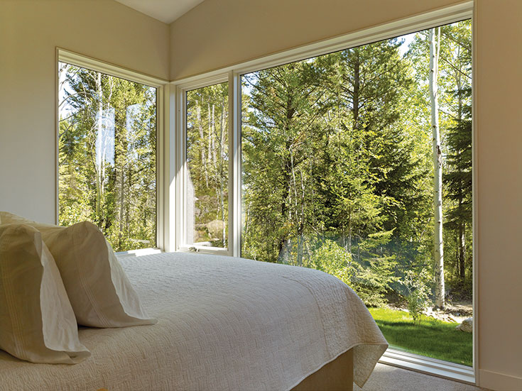
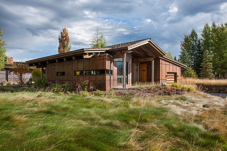
The guesthouse feels anything but small. Sun paths brushing the walls and floors add grain and depth to the airy primary living space. Because the Carneys planned to live in the house themselves while designing their main house, they installed more closet space in the bedrooms that mirror each other on either side of the column and devoted a full 12 feet to the open kitchen lining one wall.
“We just had a very disciplined approach to design. All the windows and doors stop at 8 feet. All the windows go all the way to the ground, except for the punched openings in the hallway and bathrooms.”
The materials of the guest home and detached garage are also simple: board- formed concrete, cedar shingles, bonderized steel, and glass. The slant of the roof and a 6-foot overhang on all sides distribute snow loads and protect the structure, despite the roof’s thinness.
“I think the connection to nature is the thing that people love about the house,” Carney says. “When you’re in those corner bedrooms, the window is less than 3 feet from the foot of the bed. You really feel like you’re camping in the woods.”
The Carneys lived in the guest home for three years while their main house was designed and constructed—now, they have ceded it to visiting guests and grandkids, but its lessons in focused living continue to resonate.
“I think that having the discipline of designing for small spaces makes you better even when you’re not constrained,” Carney says. The dictum to be reductive in the selection of materials, to simplify spaces, and think about what a structure should do—what it should welcome. All of this contributes to the serendipitous quality the home has, perched at the crook of a stream in the bucolic woods.
2 | THE LATER ADDITION
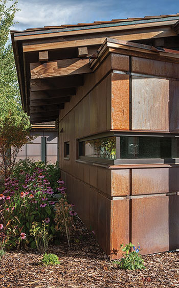
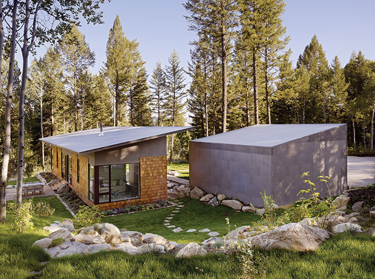
For this guest home designed by Ward + Blake Architects on 3 1?2 acres of open prairie land, the story is a classic one: After seven years, the homeowners’ family simply outgrew the main house. “Our goals were to finish what was an embryo of a design idea when we originally designed the house, which was to complete the existing courtyard,” explains architect Tom Ward. As a result, they envisioned a design that would in fact cut about 4 1?2 feet below the existing grade of the property to create the driveway that approaches the guesthouse, leaving pristine view corridors undisturbed.
Ward + Blake considered the guest home and existing home as a unified pair, and selected the same reclaimed- wood exteriors and hand-fabricated steel cladding for the guest home; over time, the unfinished steel will mottle to a patina that calls back to the fac?ade of the primary residence.
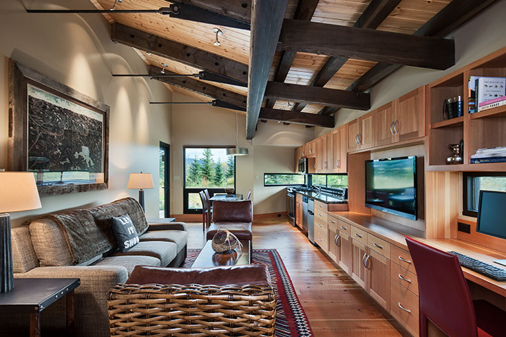
“If you’re working with a small amount of floor area, there’s a need to unify the spaces to create a sense of spatiality—break the functions into discrete rooms,” Ward says. Ward + Blake combined living room, office space, dining, kitchen, and entry into one simple, linear shape, which served the dual purpose of completing the square of the original compound’s design. Cabinetry of vertical-grain Douglas fir helps to demarcate the spatial transitions and give a sense of seamlessness to the great room’s flow. This creates one big, lifted space that “you can transition through at your own pace.”
The guest home’s entry forms another hub where doorways to bedrooms and bathrooms are located—the rest simply stretches forward in front of the eye, inviting an evolving generation of family living.
If you’re working with a small amount of floor area, there’s a need to unify the spaces to create a sense of spatiality.”
– Tom Ward of Ward + Blake Architects
3 | THE CABIN HOMAGE
One historic national park structure in Yellowstone inspired this log cabin guest home addition—the Madison Museum designed by Herbert Maier in 1929 and since designated part of a National Historic Landmark. The homeowners fell in love with the National Park Service rustic look, and Ellis Nunn Architects delivered on a classic, 1,000-square-foot, two-bedroom, one-bath cabin, complete with massive stone corners and a stone fireplace.
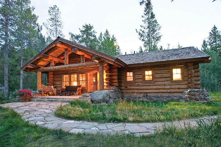
As project architect John Kjos explains, the firm made many intriguing discoveries as they updated the 1920s aesthetic for 21st-century occupants. “Instead of peeling the logs,” he says, “which can give you a uniformly light-colored look,” they chose to use a skip peel. The process of prying off the bark instead of peeling it is “more like the techniques of 100 years ago—that helps achieve a really rustic, authentic feel.”
Another detail that lends historic authenticity is the use of real wood windows instead of aluminum-clad panes. However, Kjos says, “I went for a thin roof profile,” which is an advantage of modern building in contrast to the museums that served as the cabin’s inspiration. Historically, the need to batten in from the elements meant much thicker and more substantial roofs on log buildings.
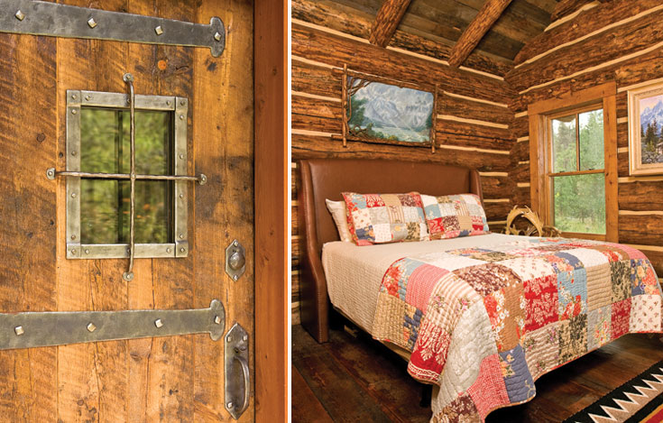
Ceilings of reclaimed wood with a small gap between the ceiling and the wall logs; Montana fieldstone (in place of the rhyolite that Yellowstone builders once sourced on-site); and a beautifully crafted door made by Yellowstone Traditions continue the guest home’s aesthetic of rugged warmth, perfectly suited to its wooded setting. In fact, the master bedroom was voted one of “20 Coziest Bedrooms” on Houzz.com.
Bigger? Not always better—as these three ingenious interpretations of extra living quarters so amply demonstrate.